Ahead of the Curve: How We Made Contract Nerds’ Terms of Use ISO-Compliant
Sep 05, 2025When the new ISO 24495-2:2025 Standard on plain language in legal communication was released last week, and many organizations scrambled to update their documents. For us, it wasn’t a surprise.
At Legal Creatives, we’ve been championing clarity, usability, and design in contracts for years. So when we redesigned Contract Nerds' Terms of Use last year in October of 2024, we deliberately built them with the ISO’s four principles in mind: Relevant, Findable, Understandable, and Usable.
Contract Nerds is a widely renown online community and publication platform dedicated to modern contract professionals. The platform features articles, templates, and guides contributed by legal experts, and has become a go-to resource for anyone passionate about contracts, lawyers, contract managers, or just curious “contract nerds.”
1. Relevant: Putting Users First
Most terms of use are written from the drafter’s perspective: long lists of disclaimers, buried liability clauses, and “just in case” provisions. The ISO standard flips that perspective, asking us to make documents relevant to the people who actually use them.
For the Terms of Use, we started by asking: What do users actually care about?
-
What these terms cover?
-
What are the users' rights and responsibilities?
-
As a contributor or a speaker, what happens to their IP?
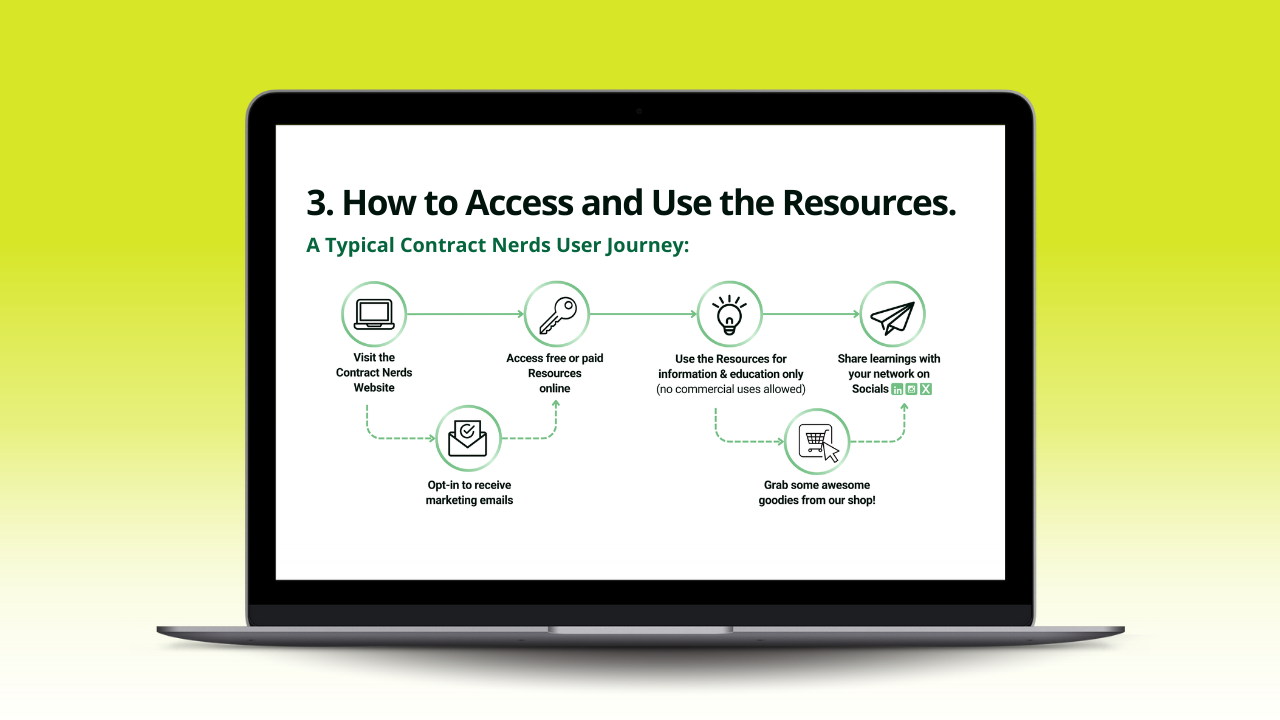
We prioritized these topics at the front, stripping away unnecessary boilerplate. For example, instead of beginning with a full page of definitions, we placed the most user-relevant provisions first. We also made a visual to clarify the typical Contract Nerds journey.
Plain language is often mistaken as “just simplifying the words,” but in reality, it goes far beyond vocabulary. It’s about structure, navigation, flow, and usability. By combining plain language with techniques like visuals, information architecture, and navigation tools, we ensured that the terms were not only clearer but also easier to use in real life.
👉 Result: Users don’t need to hunt for the information they actually came for.
2. Findable: Structure and Navigation Matter
If you’ve ever tried to locate a refund policy or cancellation clause in traditional terms of use, you know the pain. ISO’s “findable” principle requires logical structure, clear headings, and signposts so users can navigate quickly.
When we redesigned the Contract Nerds Terms of Use, we knew that simply listing sections wasn’t enough. The platform serves multiple user groups, contributors, speakers, readers, each with different needs. So instead of relying on a single table of contents, we built a multi-layered navigation system inspired by modern web design, to make sure every reader could quickly find what mattered to them.
Here’s how we did it:
-
Top & Embedded Menus: A fixed, clickable menu at the top of the document lets readers jump straight to any major section. Inside the document, we added contextual “mini menus” to act like visual signposts. No endless scrolling, no hunting. These menus give users a quick overview of subsections and help them orient themselves, almost like an interactive table of contents inside the agreement itself.
-
Role-Based Menus: Different users care about different parts. Readers don’t need the same details as contributors or speakers. By structuring role-based navigation, we cut out the noise and helped each group get to their relevant clauses faster.
-
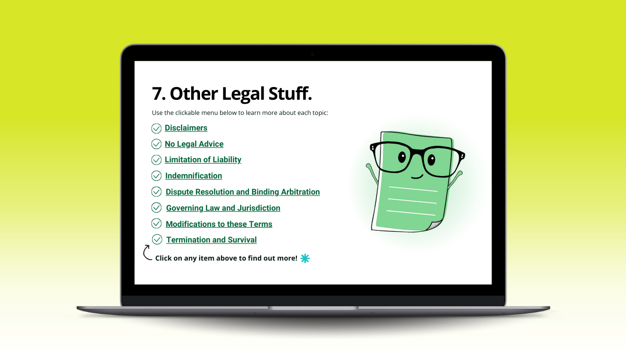
Legal Menu: For the legally curious (or the lawyers who will always dig deeper), we grouped the dense, technical legal clauses, into a dedicated Legal Menu. That way, specialists can dive straight in, while everyday users aren’t forced to wade through complexity.
- Hyperlinked all cross-references so users can jump to related sections in one click.
The outcome? Readers don’t get lost. They get answers. Whether you’re a lawyer double-checking the liability clause, or a speaker wanting to know about your rights, the Terms are now findable, scannable, and practical.
👉 Result: A reader can find the clause they need in a click. No scrolling, no frustration.
3. Understandable: Plain Language, Zero Jargon
Lawyers often think legal terms must be dense and use legalese to be enforceable. The ISO standard proves otherwise: documents are stronger when they’re understandable to their intended audience.
When we redesigned the Terms of Use for Contract Nerds, we didn’t just used plain language. We went far beyond that. Here’s what that looked like in practice:
-
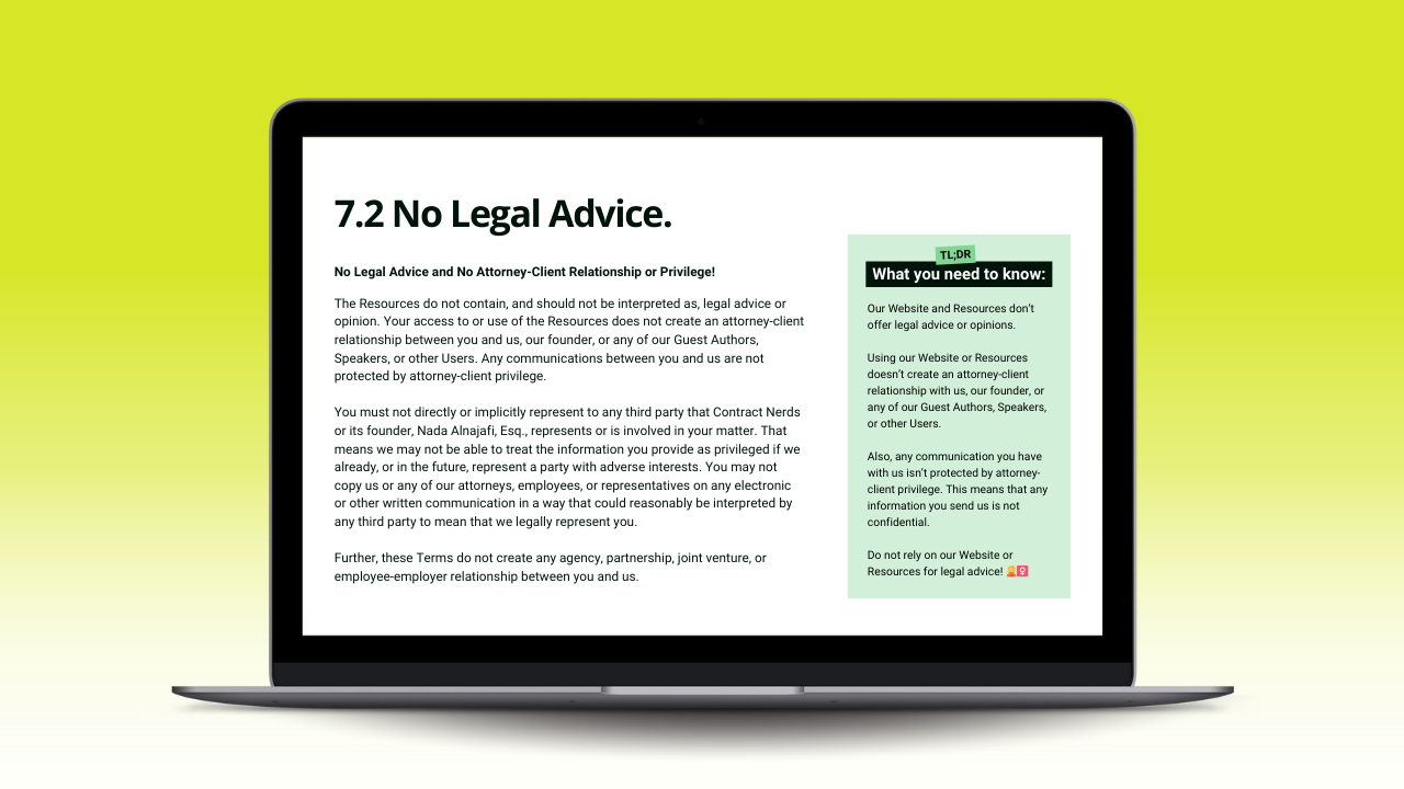
Clarity in context: For clauses with heavier legal implications, like disclaimers or liability provisions, we retained the original legal text, but paired it with a plain language explainer placed side-by-side in the layout. For instance, in the “No Legal Advice Disclaimer,” the legal clause scored 44.3/100 on standard readability scales, while the accompanying plain language summary scored a more accessible 57.8/100.
-
Levity: We also took the opportunity to introduce moments of levity where appropriate. One example is Clause 8: Opting Out of Marketing Emails, where the text reads: "Oh no 🙈 We're parting ways 💔 If you’re ready to take a break from our emails, we'll be sad to see you go, but we totally understand. Just a heads-up, you’ll be missing out on all the fun updates if you decide to unsubscribe." This more conversational tone resonated strongly with readers. Not only did it match the brand voice, but it also increased engagement. Our data showed that users found these moments of personality more engaging and users were more likely to read through the full clause.
-
The outcome? Users no longer skim and skip the Terms, they actually use them as a guide. Readers can now get through the document faster, find answers on their own, and trust that they understand what they’re agreeing to.
👉 Result: A non-lawyer user can read the Terms of Use from start to finish and actually understand what they’re agreeing to.
4. Usable: Designed for Action
The final ISO principle, usability, is about more than language. It’s about ensuring that users can act on the information with confidence.
We treated our Terms of Use like a digital product:
-
Designed with visual hierarchy (short paragraphs, bullet points, whitespace).
-
Embedded links and contact buttons directly in the text, so when the Terms say “Contact us,” the email link is right there.
-
Included examples for tricky areas.
👉 Result: Users don’t just read the Terms, they can actually use them as a tool.
We didn’t stop at redesigning the Contract Nerds Terms of Use, we tested it. Testing is the ultimate proof point that your legal text truly meets the fourth and last ISO standard about usability. No matter how skilled the drafter, experts alone can’t validate user-centricity; only real users can.
Skipping testing may feel like a shortcut (“it takes too much time,” “we don’t want to bother users”), but in reality, it leaves the last principle untouched: Usability. Avoiding the testing part all together means leaving most critical question unanswered: does the document actually work for its audience? By putting contracts in front of real users, you gain the validation that theory alone can’t deliver, and the confidence that your text is not just legally sound, but genuinely usable.
We first ran a handful of 1-1 user sessions, fully online, with users from different groups (contributors, speakers, readers). These conversations gave us invaluable insights into how people actually navigated the document. Small but meaningful changes, like refining the role-based menus and adjusting the placement of plain language summaries, came directly from this feedback.

After fine-tuning the design, we conducted a broader online survey to measure impact at scale. The results were striking:
-
Clarity of Language (4.5/5): Users overwhelmingly agreed that the wording was easy to follow. Plain language helped reduce ambiguity without undermining legal precision.
-
Balance and Fairness (4.5/5): Respondents felt the document was fair and balanced, a critical factor in building trust with the community.
-
Brand Alignment (4.3/5): The Terms reflected Contract Nerds’ brand—approachable, smart, and practical, strengthening the relationship between the platform and its users.
-
Ease of Use (4.8/5): This was the standout score. Layout improvements, side-by-side explanations, and the elimination of “walls of text” made navigation dramatically simpler.
Most telling of all: 77% of users said this new, clearer, and more transparent format directly helps build stronger relationships between them and the platform. Only 6% preferred the traditional, text-heavy format. To serve this small group, we also produced a print-friendly alternative: the same plain language text, but without colors, icons, or side-by-side visuals.

The takeaway is clear: even in legal documents, design matters. By combining rigorous legal drafting with plain language, thoughtful navigation, and visual clarity, we created a Terms of Use that doesn’t just sit in the background as an obligation, it actively supports usability, fairness, and trust.