From Fine Print to Friendly: How Big Tech Is Redesigning Legal Agreements for Humans
Aug 01, 2025Legal documents, especially Terms of Service, have long been the digital equivalent of “do not enter” signs: filled with impenetrable jargon, rigid formatting, and user-unfriendly design. Yet the need for clarity has never been greater. When legal documents are structured, clear, and accessible, they don’t just defend a business, they strengthen it. They lower transaction costs. They improve relationships. They reduce misunderstandings. And yes, they minimize legal risk.
Yet, too often, terms are treated as a formality or a defensive mechanism, something buried in footers or reserved for the “legal team.” But the reality is: contracts are part of the user experience. And like any other touchpoint, they reflect your brand, your values, and your intent. Leading tech companies are rewriting the rulebook, quite literally.
By adopting principles rooted in legal design, cognitive psychology, and neuroscience and UX thinking, organizations like Google, PayPal, Pinterest, GitHub, and LinkedIn are transforming their legal terms of service into clear, structured, and even (dare we say it) enjoyable documents. As online platforms become central to how we live, work, and transact, legal clarity is not just a nice-to-have, it’s a strategic, operational and ethical imperative. The results are both legally sound and cognitively considerate.
1. Structure: Designing for the Way Humans Think
According to cognitive load theory, people process information more effectively when it’s organized in a way that aligns with how we naturally think and act. Terms that are structured around user workflows, rather than dense legal logic, allow readers to find what they need, quickly.

PayPal’s User Agreement (as of July 16, 2025) excels in structural architecture. It features a persistent, sidebar-based Table of Contents, reflecting how people actually use the platform, with sections like “Opening a PayPal Account,” “Receiving Funds,” and “Sending Money.” Each of these is expandable and collapsible, making the content feel approachable rather than overwhelming. Subsections are clearly labeled, allowing users to jump to exactly what they need, when they need it. This modular architecture reduces unnecessary scrolling and helps users maintain orientation, even within a long and complex agreement. It’s essentially a user journey map, just in legal form.
Google’s Terms of Use (as of May 22, 2024) are a masterclass in visual hierarchy. The document uses white space liberally, minimizing visual fatigue. Key clauses are broken into digestible sections with clean headings, bullet points, and subtle background boxes that add visual hierarchy without screaming for attention.

Each section is enhanced by illustrations, paired with clear headings, helping users stay oriented throughout the document. However, most illustrations fall on the decorative side. While aesthetically pleasing, these illustrations are often too abstract to serve as standalone explanations. Their primary function is to signal a shift in topic. In that sense, they are helpful for orientation, but offer limited utility for comprehension.
What’s particularly noteworthy in Google’s design is its innovative use of in-context definitions. When a user encounters a legal or technical term, they can simply click on it to reveal a concise explanation in a sidebar on the right. This is a thoughtful and effective use of white space and interactive design, delivering clarity exactly when and where it’s needed, without disrupting the reading flow.

2. Clarity: Making the Complex Comprehensible
Clearer contracts and policies don’t just reduce misunderstandings; they also lower the barrier to compliance, helping users engage with key terms more confidently and effectively. According to cognitive load theory, reducing intrinsic cognitive load, the mental effort required to understand complex content, makes information easier to process and retain. By pairing technical legal language with plain language summaries and organizing content more logically, legal teams can preserve legal accuracy while significantly improving comprehension.
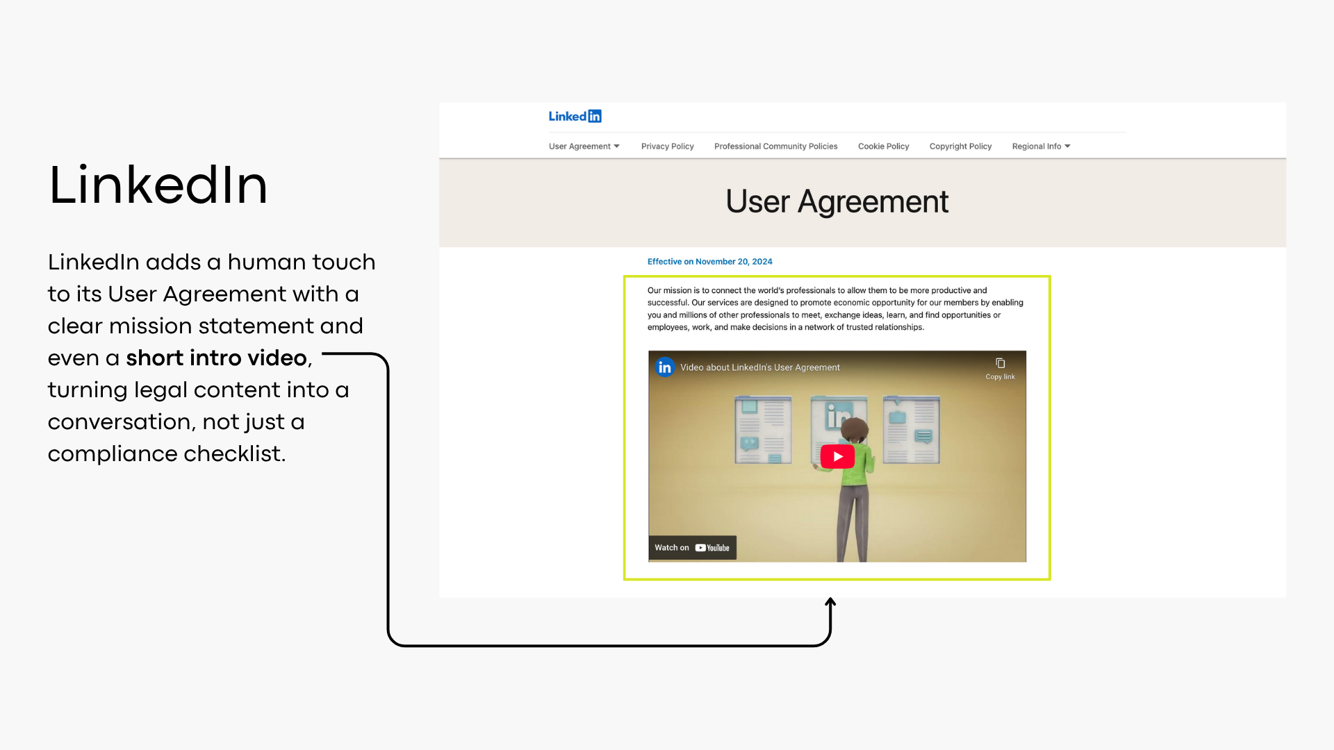
LinkedIn’s User Agreement begins with a mission statement and even includes a short explanatory video. This humanizes the content, presenting it as a mutual understanding rather than a wall of rules. Each section is also accompanied by a plain-language summary, helping readers build a mental model before diving into the finer legal details. This layered format fosters transparency and encourages informed consent without intimidation.
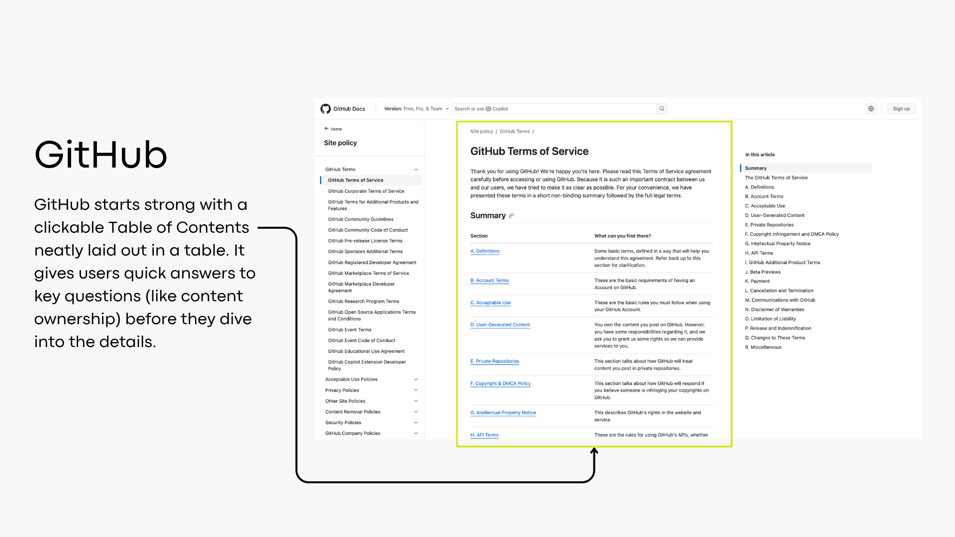
GitHub takes a structured and user-friendly approach to its Terms of Service (as of November 16, 2020). It begins with a clickable Table of Contents neatly organized in a table format, offering a high-level overview of each section. This setup is particularly smart, it gives users immediate answers to common concerns, such as who owns the content you post on GitHub, without having to dig through the full text. Following the TOC, each section begins with a “Short version”, a plain-language summary that precedes the full legal clause. This dual-layered format accommodates different user needs, offering quick insights and detailed terms for those who need the specifics.
3. Visuals: Helping Readers See the Meaning
Design is not decoration, it’s communication. Visual elements like color, icons and graphics can help highlight meaning, reinforce hierarchy, and guide attention. Done well, they make legal documents more accessible; done poorly, they become another barrier.
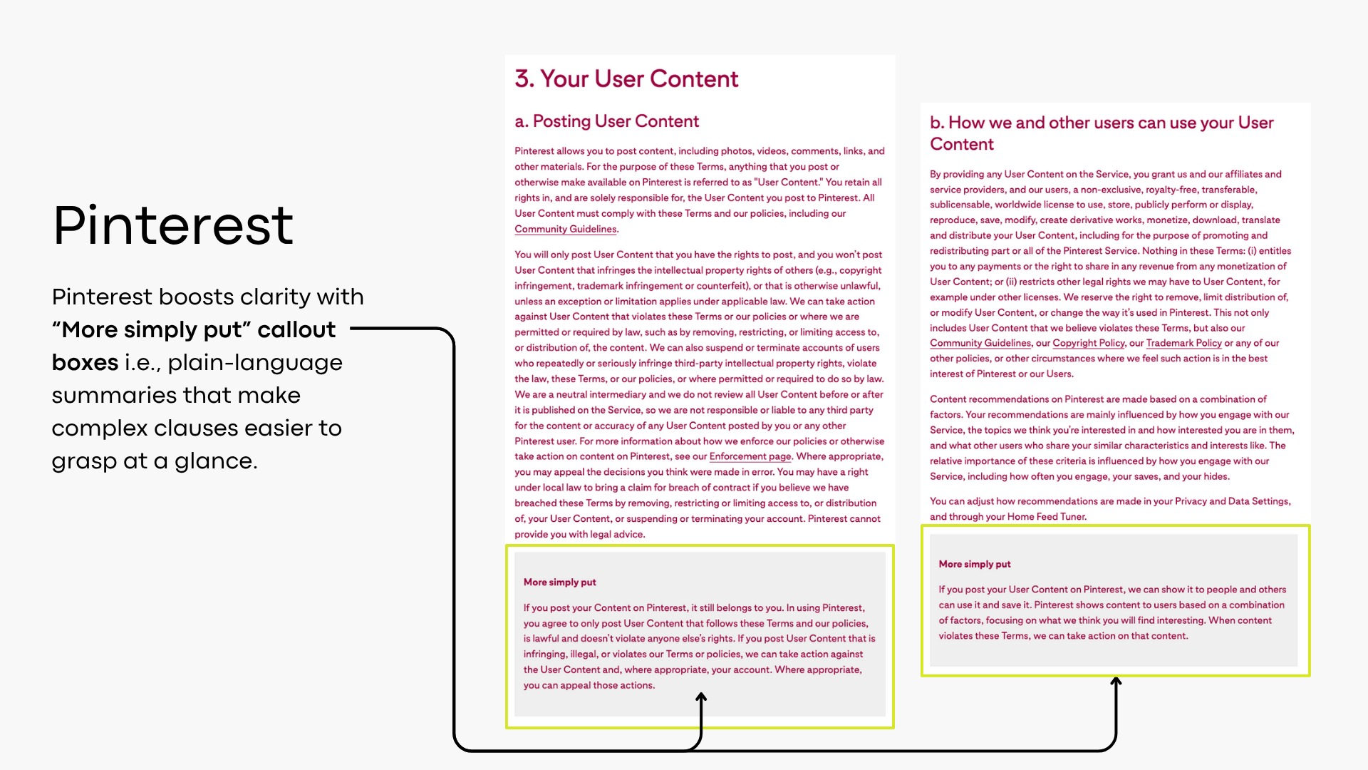
Pinterest uses dark background boxes to highlight critical clauses, such as indemnity, moving away from the traditional use of ALL CAPS or heavy underlining. It’s a smart step toward more modern legal documents. However, the dark-on-dark color scheme can compromise readability. The fix is simple: use Pinterest’s bold red as the background and pair it with a light, high-contrast font like white. This preserves visual emphasis while ensuring accessibility.

LinkedIn makes a commendable effort to incorporate visual cues into its User Agreement, primarily through the use of colored text boxes paired with a recurring lightbulb icon to signal plain-language summaries. While the intent is solid (signposting clarity), the execution starts to feel a bit... dim. The lightbulb, though friendly at first, quickly loses its spark when repeated section after section, especially when paired with generic summary phrasing like: “These are the limits of legal liability we may have to you”, only to be followed by an impenetrable wall of ALL CAPS legalese.

There’s an opportunity here to rethink how visuals can support meaning, not just formatting. For instance, using icons tailored to each section heading (e.g., a shield for liability, handshake for obligations, globe for data use) could provide both variation and context. This approach would enhance both orientation and comprehension, reducing redundancy while keeping the interface professional and inviting. To be fair, visuals is the weakest link for all these terms of use, but that’s not a high bar to raise. And it doesn’t require a full design team to improve. Simple formats like tables, timelines, decision trees, or flowcharts can dramatically elevate understanding.
Take PayPal, for example. It uses tables to structure information, like the "dos and don’ts" of preauthorized payments, breaking complex obligations into clearly categorized rows. This not only helps users find relevant information faster but also subtly nudges them toward compliant behavior. This structured presentation breaks up information and improves retention, especially for compliance-heavy content. When legal content is well-organized and visually distinct, it becomes easier to adopt, retain, and act on, which is, after all, the whole point.

Strategic use of visuals like timelines, flowcharts, and decision trees can dramatically improve comprehension and engagement, especially in complex or process-heavy sections of Terms of Use. Here’s where to use them effectively:
1. Payments, Fees & Billing Cycles: Use a timeline to illustrate when charges occur (e.g., trial period → first billing → renewals → cancellation deadlines). It helps users grasp payment obligations at a glance and reduces support inquiries.
2. Account Suspension or Termination: Use a flowchart to show the sequence: warning → violation → review → suspension → appeal process. It makes enforcement policies feel more transparent and fair.
3. Dispute Resolution or Claims Process: Use a decision tree to guide users:
"Do you have a billing complaint?" → "Yes" → "File here" . It offers clarity in high-stakes or sensitive situations.
Graphics don’t replace the legal text, they enhance comprehension, support trust, and reduce risk by making the information more accessible. Just ensure the visuals are kept simple, accurate, and updatable (no need for complex graphics tools, Word and PowerPoint work just fine).
4. Support: Ensuring Legal Self-Service Success
In legal documents, support means scaffolding the experience so that users can make sense of what they’re reading without additional help. This includes embedded aids for navigation. In long legal agreements, embedded support like navigation aids isn’t a luxury, it’s essential. Without it, users are forced to scroll endlessly or re-read dense sections just to find what they need, leading to confusion, frustration, and errors.
GitHub’s clickable Table of Contents, paired with section summaries, offers a well-structured overview. Pinterest’s digital-first format with its persistent Table of Contents supports non-linear reading, ideal for users looking for answers in the sidebar menu, rather than long texts. Google’s sidebar menu provides quick access to major sections like “What we expect from you” and “In case of problems or disagreements.” Google’s Terms of Use include smart interactive features, like a top menu linking to related policies and clickable in-context definitions. These elements make legal terms easier to navigate and understand, without forcing users to jump back and forth to fill in the gaps.

PayPal’s sidebar menu is another prime example of supporting users as they navigate the terms. It helps you skip the scroll and go straight to what matters. Additionally, PayPal uses color-coded headers to segment the terms: green for “Sending Money,” blue for “Selling,” and red for “Restricted Activities.” This allows users to navigate by visual memory, a powerful cue when scanning long documents.
A well-designed structure, with clickable tables of contents, headings, and visual cues, acts as scaffolding. It helps users stay oriented, understand complex terms in context, and engage with the content more efficiently, reducing cognitive load and increasing document's effectiveness.
Comparative Feature Table
This comparative analysis of Google, PayPal, Pinterest, GitHub, and LinkedIn reveals a clear trend: Terms of Service are getting smarter, friendlier, and more human. By reducing cognitive load and increasing transparency, these companies are building not just better contracts, but better relationships. These examples illustrate what happens when companies treat their terms not just as legal safety nets, but as functional, trust-building tools.
| Feature | PayPal | GitHub | |||
|---|---|---|---|---|---|
| Structure | ✅ | ✅ | ✅ | ✅ | ✅ |
| Plain Language | ✅ | ✅ | ✅ | ✅ | ✅ |
| Clause Summaries | ❌ | ❌ | ✅ | ✅ | ✅ |
| Visual Cues / Icons | ✅ | ✅ | ❌ | ❌ | ✅ |
| Graphics / Charts | ❌ | ✅ | ❌ | ❌ | ✅ (video) |
| Persistent TOC / Sidebar Navigation | ✅ | ✅ | ✅ | ✅ | ❌ |
| Visual Consistency / Branding | ✅ | ✅ | ✅ | ✅ | ✅ |
Why This Matters (and What It Means for You)
Legal Design isn’t about dumbing down contracts. It’s about designing them for how people actually use them, as tools for decision-making, trust-building, and doing better business. Because legal doesn’t have to mean unreadable. And great design? That’s just good business.
If you’re ready to build trust and reduce legal risk at the same time, we can help. Our Contract & Legal Design Certification is open for enrollment. Join our 8th cohort, go self-paced, or apply for our private program if you have a special project in mind.
When we teach Contract and Legal Design, we go beyond theory. We apply these principles to real-world scenarios and walk through them live, so the results are not only demystified, but instantly replicable. For example, during a live workshop we led as part of the Legal Project Management course at a major university, we tackled a daunting challenge: a complete redesign of Zoom’s Terms of Use. Here's what we achieved:

The results?
✅ Easier to navigate with a sticky sidebar and clickable sections
✅ Less overwhelming thanks to effective use of white space and chunked content
✅ Simpler to understand through plain-language summaries and
You don’t have to compromise legal accuracy to make your contracts and policies more human. You just need the right framework, and a bit of a push to actually make it happen. Inside our Hands-on Online Program, we can help with both.
And for law firms or in-house legal teams, we also offer tailored support. From strategy development to hands-on implementation, we’ll guide you through every step to successfully integrate legal design into your service offering.
📩 To learn more or schedule a consultation, contact us today at [email protected]