From Static Text Walls to Interactive Compliance Interfaces
Jul 17, 2026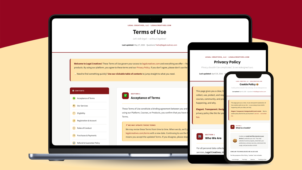
Traditional public legal documents trigger instant user fatigue and create hidden operational risks. "It’s not just what your contracts say, it’s how your platform presents them." When online terms are challenged in court, enforceability rarely turns on the substance of a boilerplate clause, it turns on whether the interface gave users clear, conspicuous, and reasonable notice.
To bridge the gap between bulletproof legal protection and beautiful interface design, we engineered a functional framework optimized entirely for the modern, scanning reader.
Clear. Straightforward. Readable. Easy.
When users first interact with our modern legal interface, their feedback forms a perfect consensus. They describe it as friendly, structured, uncluttered, and calm, completely removing the natural anxiety caused by traditional legal jargon.
Deconstructing the Interface Layout
What makes this interface fundamentally performant is how it actively handles user attention. By approaching public terms as a piece of functional software rather than a static document, we built scalability natively into the architecture:
Information Layering and Modular Containment: The continuous stream of linear text was dismantled. Every distinct legal topic was rehoused into its own modular text container. This containment strategy prevents information spillover, visually "chunks" the data, and allows the user to focus on one specific rule at a time without experiencing cognitive overload.
Functional Color and Iconography: Moving beyond pure aesthetics, color and iconography were deployed as systematic cognitive aids. Specific brand-aligned visual signposts and semantic signals were integrated to highlight key risk allocations, making the skimming and scanning process significantly faster and more intuitive.
Persistent Sidebar Navigation: To accommodate non-chronological digital reading habits, the linear scroll was replaced with a persistent, interactive sidebar menu. This allows users to treat the legal document like a dynamic map, providing immediate access to distinct sections and prioritizing their time.
Mobile Responsive: Unlike static PDFs or word processing files, the agreement was built on a fully responsive HTML framework. This ensures that the precise visual hierarchy, font contrast, and layout structural alignment remain perfectly intact whether accessed via a mobile device, tablet, or desktop screen.
Want to see this template in action?
Experience how we implemented this exact structured layout across our own legal policies:
Advanced ISO Alignment & Clarity Metrics
To satisfy rigorous global transparency metrics without compromising core legal protections, the document architecture was entirely re-engineered. The final asset was structured to map directly to the four core pillars of ISO 24495-1 (plain language) and ISO 24495-2 (legal communication), setting a verifiable global benchmark:
- Findability: Utilizing menus and sidebar navigation so vital terms are discoverable in seconds.
- Understandability: Structuring text with layered summaries so it can be comprehended on the first read.
- Usability: Treating the final compliance document as a highly functional, active digital tool.
- Relevance: Curating information tailored directly to the user’s real-world context.
To objectively measure this alignment, we conducted targeted user testing sessions and surveys where participants completed specific data-retrieval tasks within the interface. When asked to evaluate the platform's performance against these exact ISO pillars, the interface achieved exceptional, data-backed ratings across every dimension:
Note on the Relevance Metric: While 4.6 is an incredibly strong outcome, the slight variance from our near-perfect design scores points to a deliberate strategic constraint. The core mandate of this framework was to strictly reorganize and house the existing terms rather than rewriting, shortening, or deleting substantive legal copy. This nuance is highly valued by legal teams: it proves you can achieve comprehensive ISO compliance and stark readability improvements while keeping original, hard-won protective language completely intact and legally airtight.
The Verdict on Legal Defensibility
Modern courts increasingly penalize "fine-print inertia." When users scan rather than read, burying critical terms behind unformatted text walls introduces enforceability risks under modern consumer protection and digital contract jurisprudence. By converting static policies into a design-locked, responsive web experience:
1. You satisfy judicial standards for clear & conspicuous notice.
2. You create an audit trail of ISO-aligned transparency.
3. You turn a regulatory requirement into a commercial asset—with 62% of respondents citing Elevated Brand Trust as the primary benefit of the framework.
Modern users scan; they don't read. When asked if this layout feels like a respectable, trustworthy, and compliant way to present mandatory terms, 100% of surveyed legal professionals endorsed the framework (57% stating it actively enhances brand trust while fully maintaining integrity, and 43% confirming it represents a major upgrade over traditional text walls). Exactly 0% preferred a traditional text layout.
Core Roadblocks to ISO Alignment and Modernization
If global standards and legal metrics favor structured interfaces, why do teams hesitate? Our Community Field Study revealed two root friction points:
- Fear of Liability & Enforceability (33%): The misconception that changing document presentation jeopardizes contract enforceability.
- Lack of Visual Design Knowledge (33%): Legal and compliance teams rarely have in-house technical skills to build responsive compliance interfaces.
These two roadblocks are deeply linked: when teams lack the specific structural knowledge to execute layouts correctly, they naturally fear the liability of doing it wrong. Modern legal interface design isn't about artistic illustration, it’s about information architecture, visual hierarchy, and functional layout.
Mastering Visual Literacy in Action
To help legal teams build this essential baseline knowledge, we wrote the definitive methodology published by the American Bar Association (ABA) Book "Visual Literacy for Lawyers." It is the ideal starting point for mastering scalable document hierarchy, layering principles, and legally sound compliance structuring safely.
Deploy the New Interface Standard Immediately
For organizations looking to implement a scalable, visual approach right away without navigating the learning curve internally: At Legal Creatives Studio, we architect, engineer, and deliver your compliance documents as a production-ready HTML interface tailored specifically for your platform.
Collaborate with The Studio →💡 Found this insightful? Share it with your legal ops & in-house network: